As time goes on, websites continue to heighten the standard for good design. As a result, peoples’ expectations of your own website are raised just as high. This makes it essential for your organization to not only meet this new standard of excellence, but to truly “wow” your supporters with materials that are well-designed (really make em say ooooo and ahhh).
A website that is well-designed should make it easy for visitors to learn more about your cause, offer options on ways to become more involved with your organization, and – of course – how to donate quickly.
Well we’ve got you covered! Below, we’ll walk you through how to increase donations for nonprofits through good web design that’ll grab your visitors attention, build trust and (most importantly) maximize those donations!
Emphasize Your Advocacy
Imagine the frustration your user would have trying to figure out where your donate page was if you had a menu like Amazon? It would be incredibly challenging for a user to navigate your website if your web design is cluttered with an overwhelmingly large number of buttons or directives. The best web design involves emphasizing the context of your organization and making it clear what you need from your audience: their donations. When you use the right fonts, colors, buttons, and text sizes, your website will effectively direct your audience to that one specific goal.
Another thing to keep in mind and to pay close attention to is your web pages’ load time. As a non-profit organization, showing testimonies from the people you have helped along the way is a great way to connect with your audience. However, not optimizing your website elements, like scrolling testimonials, will cause your web pages to lag. Remember that page speed doesn’t have much to do with the volume of data; instead, ensure that every photo and video is optimized to make the loading time as quick as possible. Otherwise, you risk losing your visitors as they may exit your site out of frustration before they can decide to donate.
Boost Engagement
The primary component of a well-designed website is complete, necessary web pages (duh). This includes the contact and blog pages. The right website strategy is feeding your website with updated stories about your beneficiaries that can touch the heart of your audience, leading to their desire to contribute to the organization’s advocacy and ultimately make a difference. This is also the reason you should keep your contact page clear and updated. People who donate will want to make sure that they are giving it to the proper organization, so keep your numbers up-to-date if anyone wants to confirm payment details or visit your headquarters first to donate personally.
Another way to boost engagement is to post your upcoming events to your homepage so people can easily see them and know what’s coming. Make it easy for them to sign up or visit the link where they can join. Online events can help your audience understand your organization and advocacy on a deeper level.
Direct Visitors to Donation Page
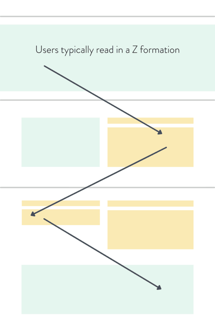
According to experts, when people read printed material, they read the page in a Z pattern, starting from the upper left, going to the right, leading down to the end of the text at the lower right corner. Although this fact is for physical publications only, the best thing that we can learn from this is people follow a pattern when scanning a web page.

So, when you are designing your website, mind the placement of every element. Although the goal is to direct them to the donation page, you should first emphasize the organization’s mission and vision. Decide how you will arrange your website elements to lead your visitors through a journey that will trigger their donation. Make sure to optimize your donation page to make it easy for anyone to place a donation!
Let’s Talk, Honey!
Almost every entity has a website now, and that includes non-profit organizations. However, for a website to stand out in the digital world, it has to be well-designed. A website with a clean design is more important for nonprofit organizations as they aim to drive more visitors to gain more donations.
Your brand deserves a powerful presence so you can share your beneficiaries’ stories and amplify your impact. Our creative agency can help you achieve your goal with our web design services. Let’s talk about it. Send us a message!


