
It’s apparent that every business and organization seeks to be accessible. Of course, you want your product, your service, your vision to be seen by everyone! But when we sit down to really think, who do you really mean by everyone? Are we truly thinking about all people, all abilities, all backgrounds?
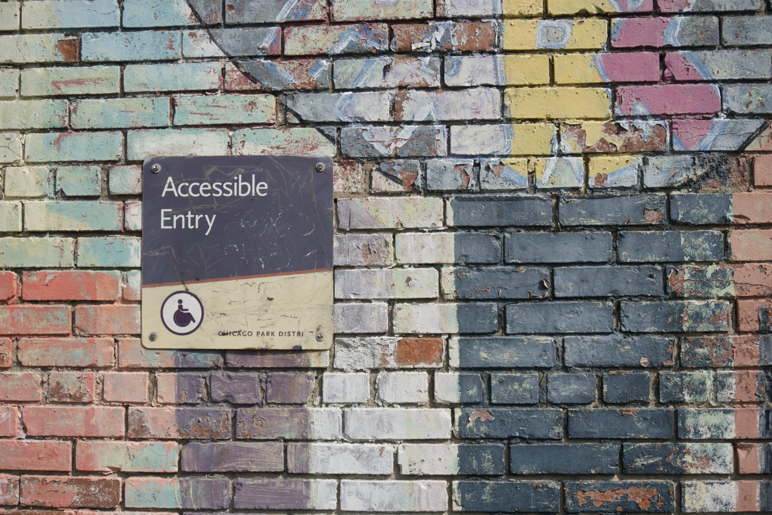
A lot of people think of the physically disabled when they hear accessibility but ultimately it’s about ensuring everyone is having the same experience. “In architectural design, you often see ramps or elevators placed near a main stair for this purpose, so that the path to an upper floor is the same as if they had taken the main stair,” says Katie Halsey, Architectural Designer. “I think the same concept should be thought about in the visual world as well, does everyone take the same path to experience viewing your brand?”
Accessibility might not be the first thing that comes to mind when thinking about your brand’s priorities but with nearly 1 in 4 Americans currently living with a disability (1) and after 2020 shifting much of our daily routines online, it’s crucial to ensure your brand is considering inclusivity across its platforms.
So wait, what is accessibility anyway?
Accessibility, in a nutshell, is the practice of making your brand, or anything for that matter, more usable by as many people as possible. From websites to social media posts, it’s an effort to communicate to individuals across a wide spectrum of abilities.
Why is accessibility important?
By developing your brand in a way that’s mindful of individuals that may experience your messaging in a nontraditional way, you’re effectively widening your reach and making it better for all. Who doesn’t want better branding and a wider audience? No brainer!
Where do I start?
From websites to color palettes, there are a number of opportunities to increase your brand’s consideration of other communities. It can be overwhelming to try and adhere to accessibility standards all at once—it’s a complex and dense line of study— but there are a few considerations to increase your brand’s accessibility efforts.
1. Color
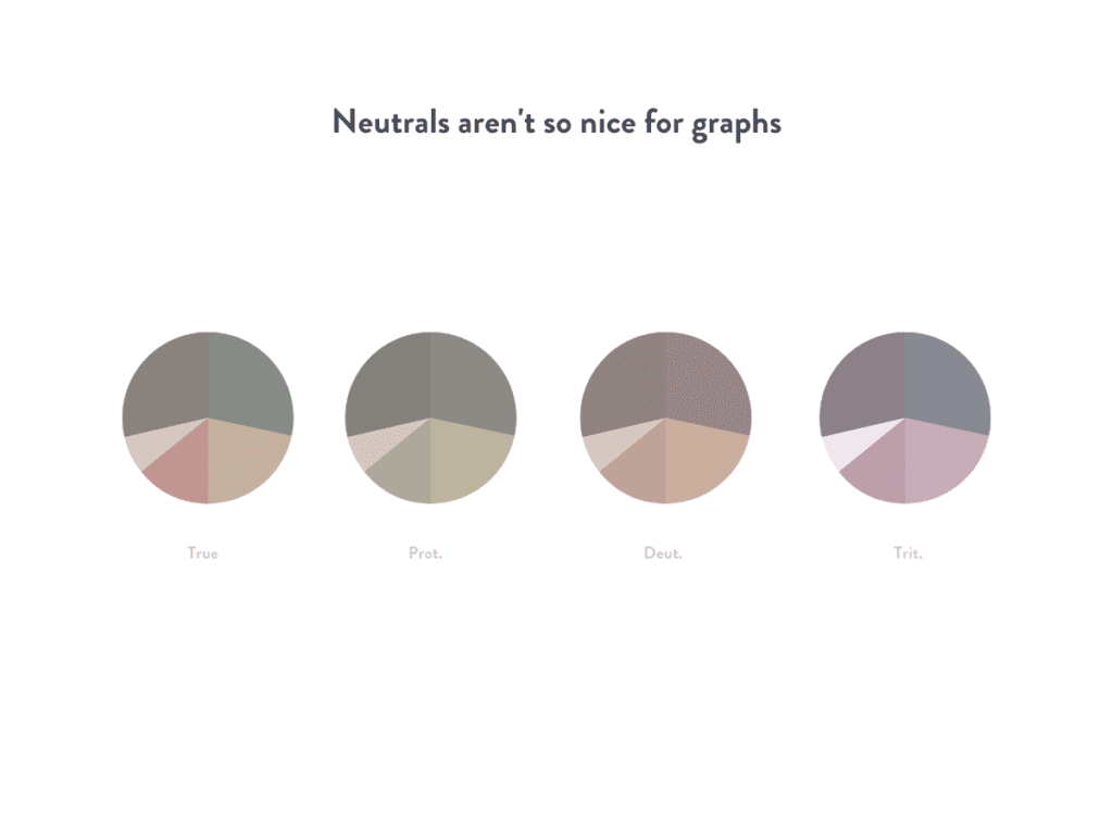
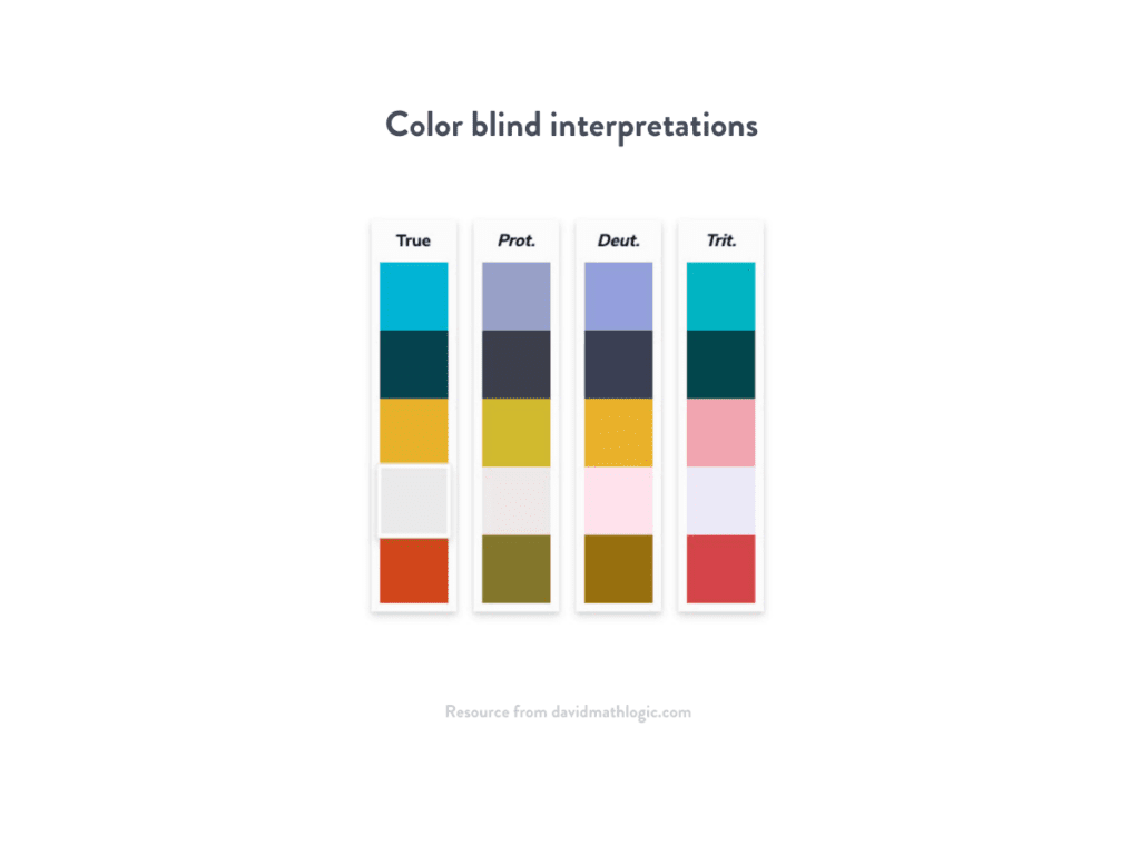
About 1 in 12 men experience color blindness and 1 in 200 women worldwide (2). This occurs when one or more cones in the eye don’t function properly, causing a more limited spectrum of color. Individuals experiencing various types of color blindness might see two unique colors as the same. This presents a number of challenges when a design is entirely dependent on color for interpretations, like charts or graphs.
Ways to improve color reception:
- Use color blind simulations like this one to check how your brand colors are perceived and which combinations to avoid
- Rely on other ways to differentiate between items on charts and graphs like pattern or labels
- Use ‘flagging’ techniques to alert errors like Xs and messages for website forms, not just red and green indicators
- Maintain a ratio of at least 70% contrast between background and type color
- A good rule of thumb is pairing complementary colors (opposites on the color wheel) that vary in intensity, value, and saturation
- Avoid red on black warning messages
2. Type
The typical approach to typography for accommodating low vision or impairment is to increase the size of the type (aka the Jitterbug effect). Usually, type above 16 pt is recommended for audiences with visual impairment or age-related deterioration. However, that might mean more expensive printing costs for additional pages or larger-sized paper to compensate for the bigger copy. But there are a number of other ways to increase both legibility and readability with these considerations:
- Weight & Shape: Slim and trim is better!
- Typically regular or medium weights are preferred over bulky, heavy weights because of the contrast between letterforms. The ‘open’ or negative space between the strokes that create the letter itself helps with legibility. Pay close attention to the vowels in the example below.
- Typography: Character matters!
- The jury’s still out on preference for sans vs serif. Serif is often preferred for long passages but the simplicity of character in sans can help distinguish between letters easier.
- Top recommended fonts include Arial and Comic Sans (*gasps in Comic Sans*), based on British Dyslexia Association Style Guide, along with Open Sans, Calibri, and other system-familiar fonts.
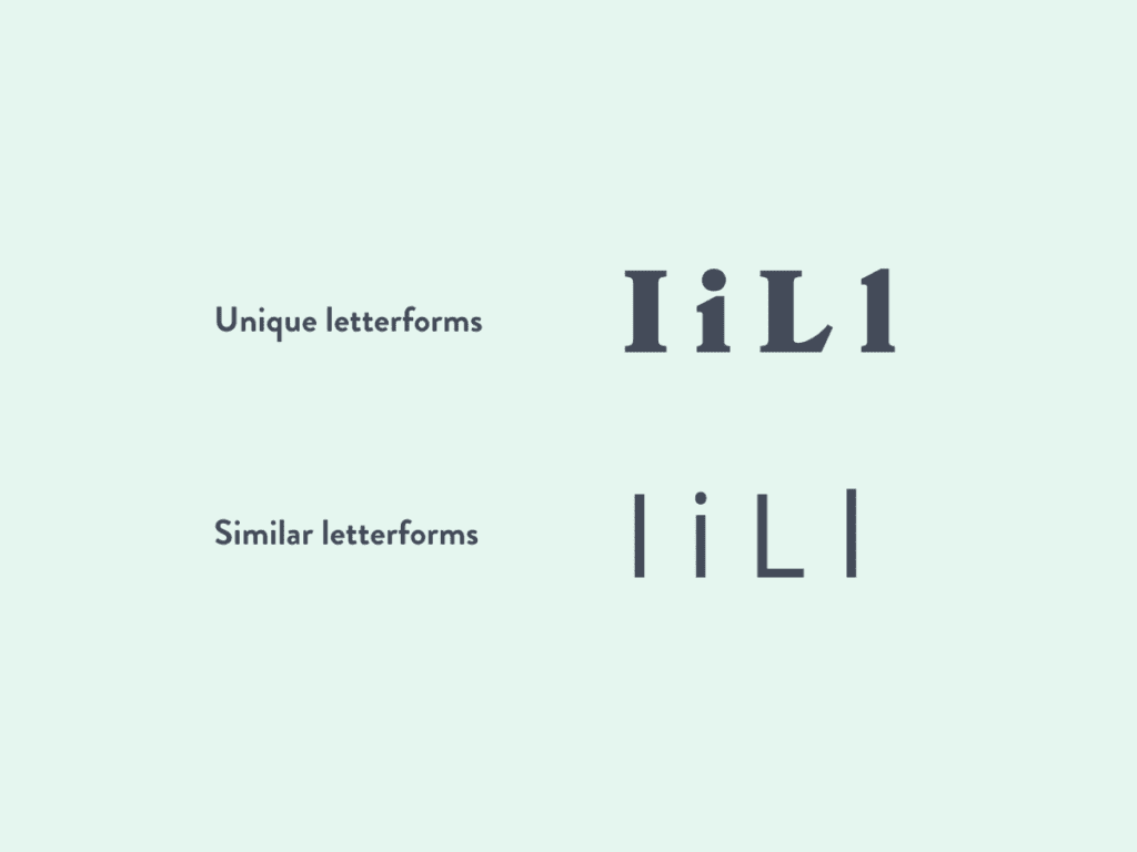
- When selecting a font it’s more important to check that there are clear differences between letters that could be commonly mistaken for the same, like a lowercase l vs an uppercase I.
- Avoid Display fonts
- X-height: Being tall means you can see more!
- Taller x-height (the height from the baseline to the height of the lowercase letters) fonts are considered more legible. This doesn’t mean you can’t select squatty fonts at all but keep in mind the font size when choosing a shorty. Check out the below example.
- Width-to-height ratio: Equal for all!
- Super wide or very tall and skinny fonts prevent legibility, more equal width-to-height typefaces are preferred.
3. Formatting
Have you ever tried to read an ingredient label and struggled to decipher words between the complicated list? The long words aren’t the only contributor to the confusion. All uppercase, center justified, and small leading (the space between lines) make for a muddied mess. The same can be applied to copy formatting to help improve readability for individuals affected by dyslexia or other reading impairments:
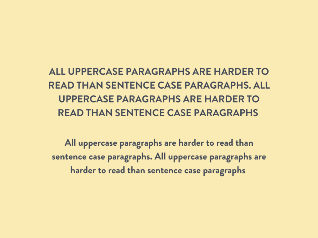
- Avoid all uppercase paragraphs
- Use bold or weight variances rather than underlining
- Keep a leading to type size ratio of at least 120% (i.e.10 pt type, 12 pt leading)
- Use bullet points and headline breaks
- Use slight kerning (the space between letters) to limit the density of a paragraph
- Lines of text should be limited to 80 characters or less to help with readability (That statement was 81 characters, for context, use a character counter to help)
- Maintain margins of between .75”-1”
While there is an overwhelmingly large amount of information available to assist in improving accessibility from a variety of applications, simply using an accessibility lens helps to reframe possible issues and see potential opportunities.
Other helpful resources:
- Character counter: https://charactercounttool.com/
- Colorblind image simulator: https://www.color-blindness.com/coblis-color-blindness-simulator/
- Color palette simulator: https://davidmathlogic.com/colorblind/#%23005AB5-%23DC3220
- Chrome extension color blindness simulator: https://chrome.google.com/webstore/unsupported?hl=en&gl=US
- Contrast Checker: https://webaim.org/resources/contrastchecker/
- Test Your Site’s Accessibility: https://tenon.io/
- Website Guidelines: WCAG
Ready to improve your brand accessibility? We’ve got the checklist you need!